
HONG KONG MILK COMPANY × EMART24
Collaboration Design / Brand Application / Packaging / Production Management / Vendor Coordination
In-house Project · GLOW SEOUL
(KO)
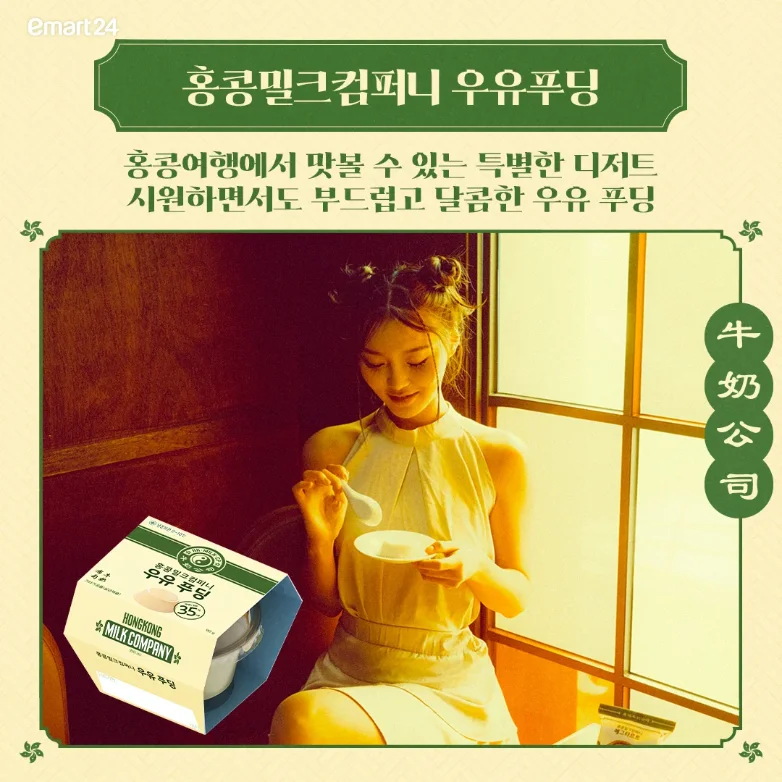
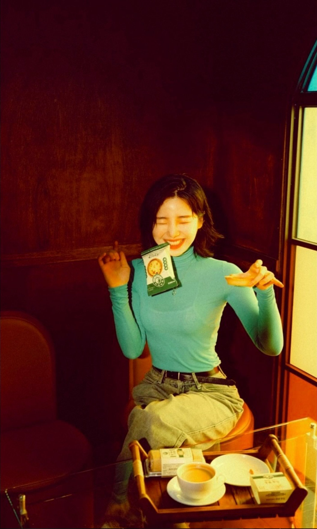
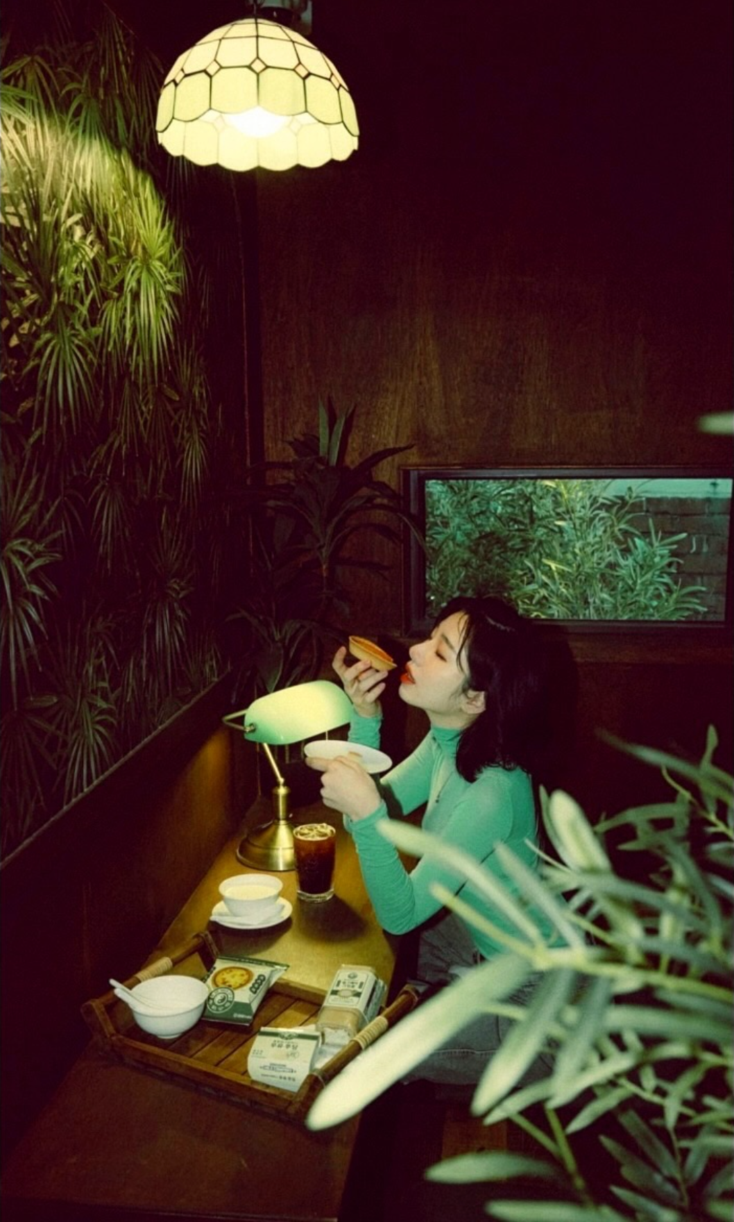
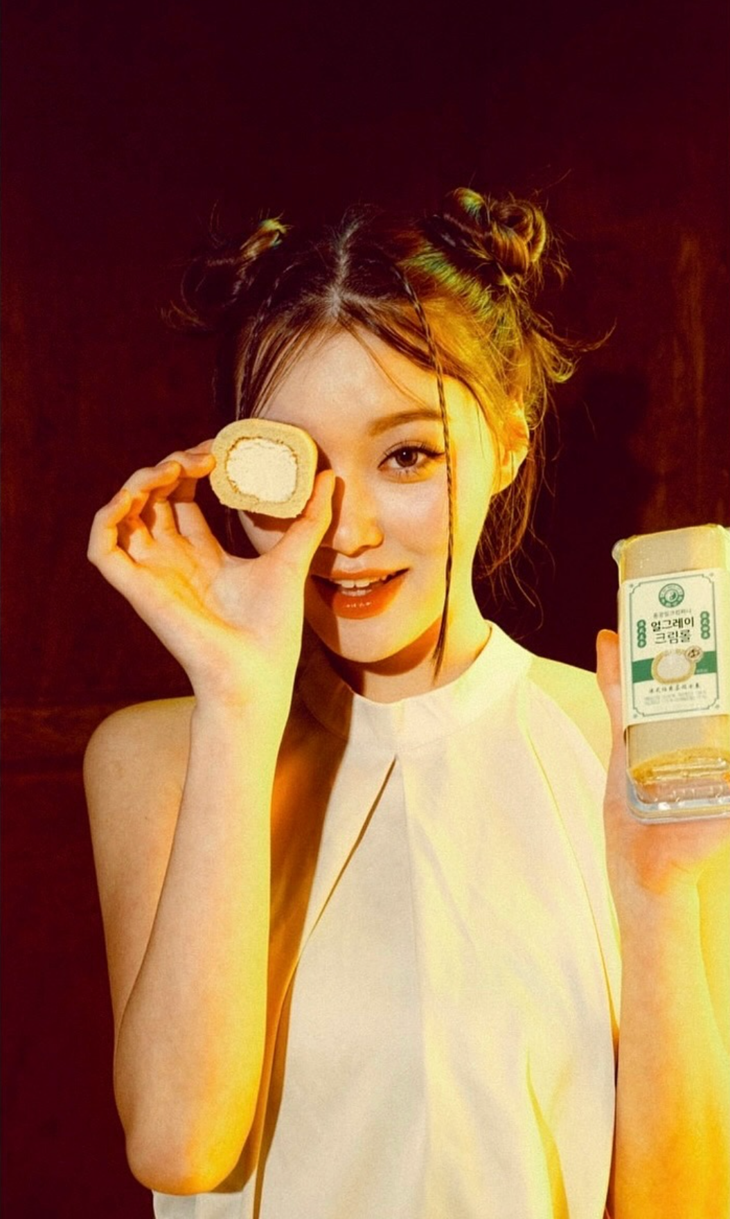
홍콩밀크컴퍼니의 브랜드 이미지를 편의점이라는 보다 대중적인 유통 환경으로 확장한 협업 프로젝트입니다.
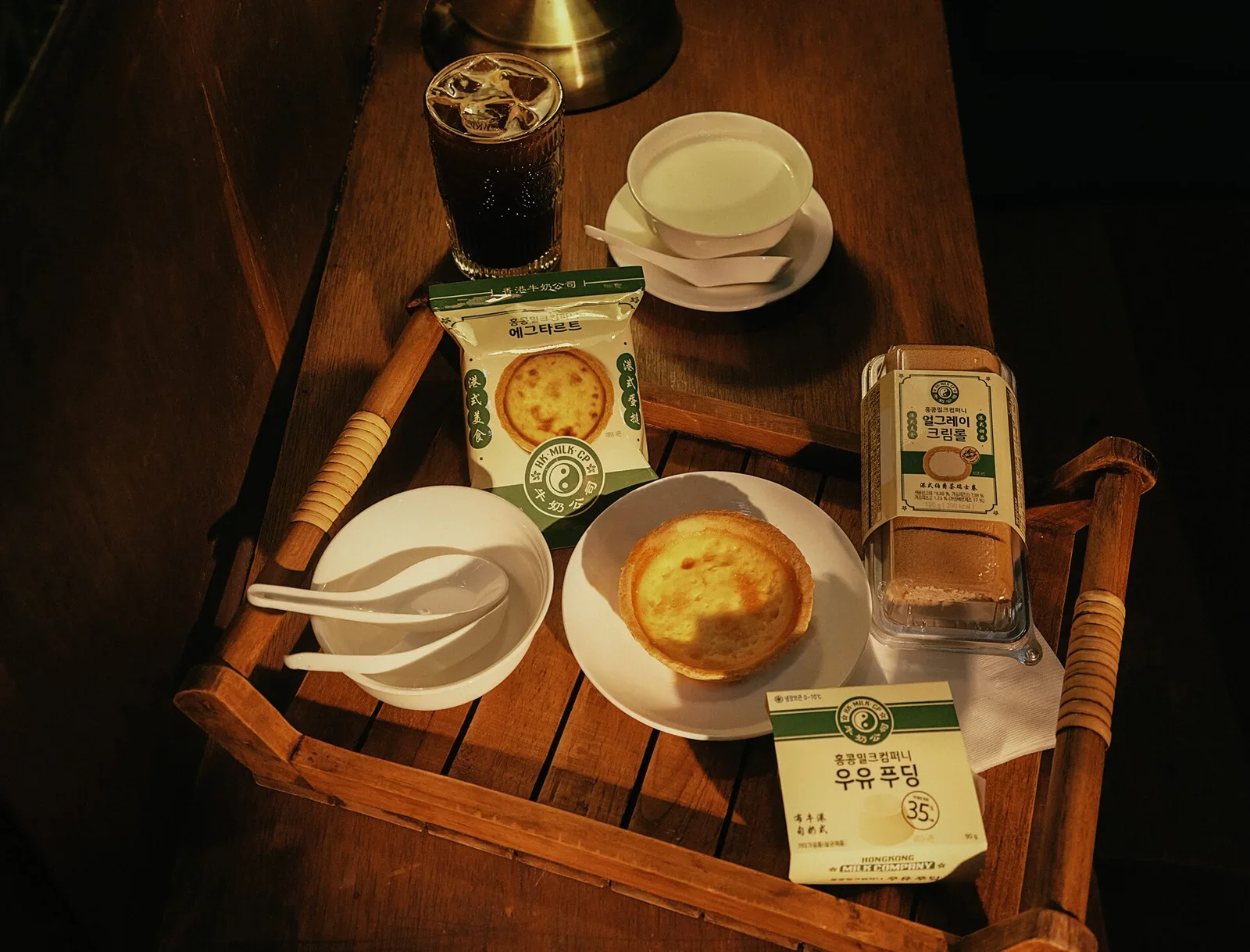
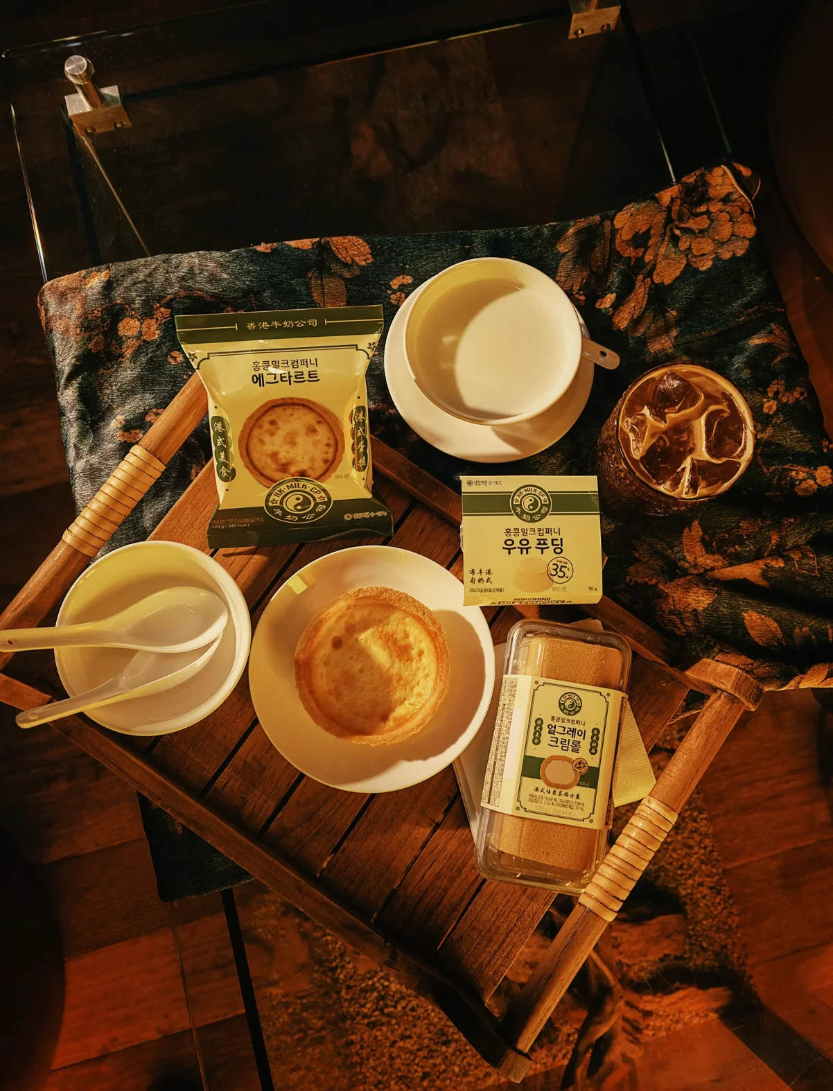
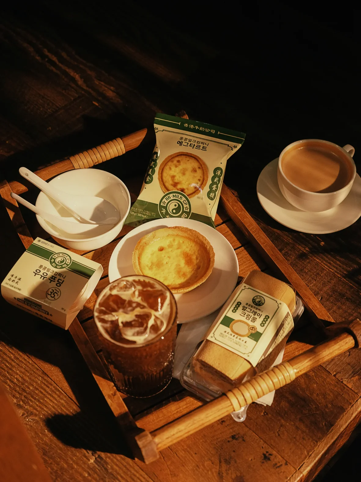
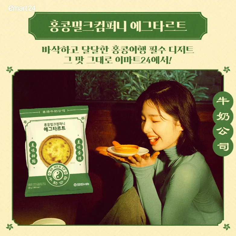
기존 브랜드가 가진 컬러와 홍콩 로컬 특유의 그래픽 인상은 최대한 유지하면서, 처음 브랜드를 접하는 고객도 제품의 종류와 특징을 빠르게 파악할 수 있도록 패키지의 정보 구조를 보다 직관적으로 정리했습니다.
다양한 상품이 함께 놓이는 편의점 가판 환경을 고려해 멀리서도 제품이 눈에 들어오면서 홍콩밀크컴퍼니다운 인상은 유지될 수 있도록 가시성과 브랜드성을 함께 조율했습니다.
(EN)
A collaboration project extending Hong Kong Milk Company's brand image into a more mainstream retail environment: the convenience store.
The brand's existing colour and its distinctly Hong Kong local graphic character were kept as far as possible, while the information structure of the packaging was made more intuitive so that customers meeting the brand for the first time could quickly grasp each product's type and character.
Given a convenience store shelf where many products sit side by side, visibility and brand character were balanced so that the products would catch the eye from a distance while still reading as Hong Kong Milk Company.

Selected images by GLOW SEOUL / EMART24 / 花流館.