
CHANG CHANG
Brand Identity / Brand Application / Packaging / Signage & Environmental Graphics / Production Management / Vendor Coordination / On-site Supervision
In-house Project · GLOW SEOUL
(KO)
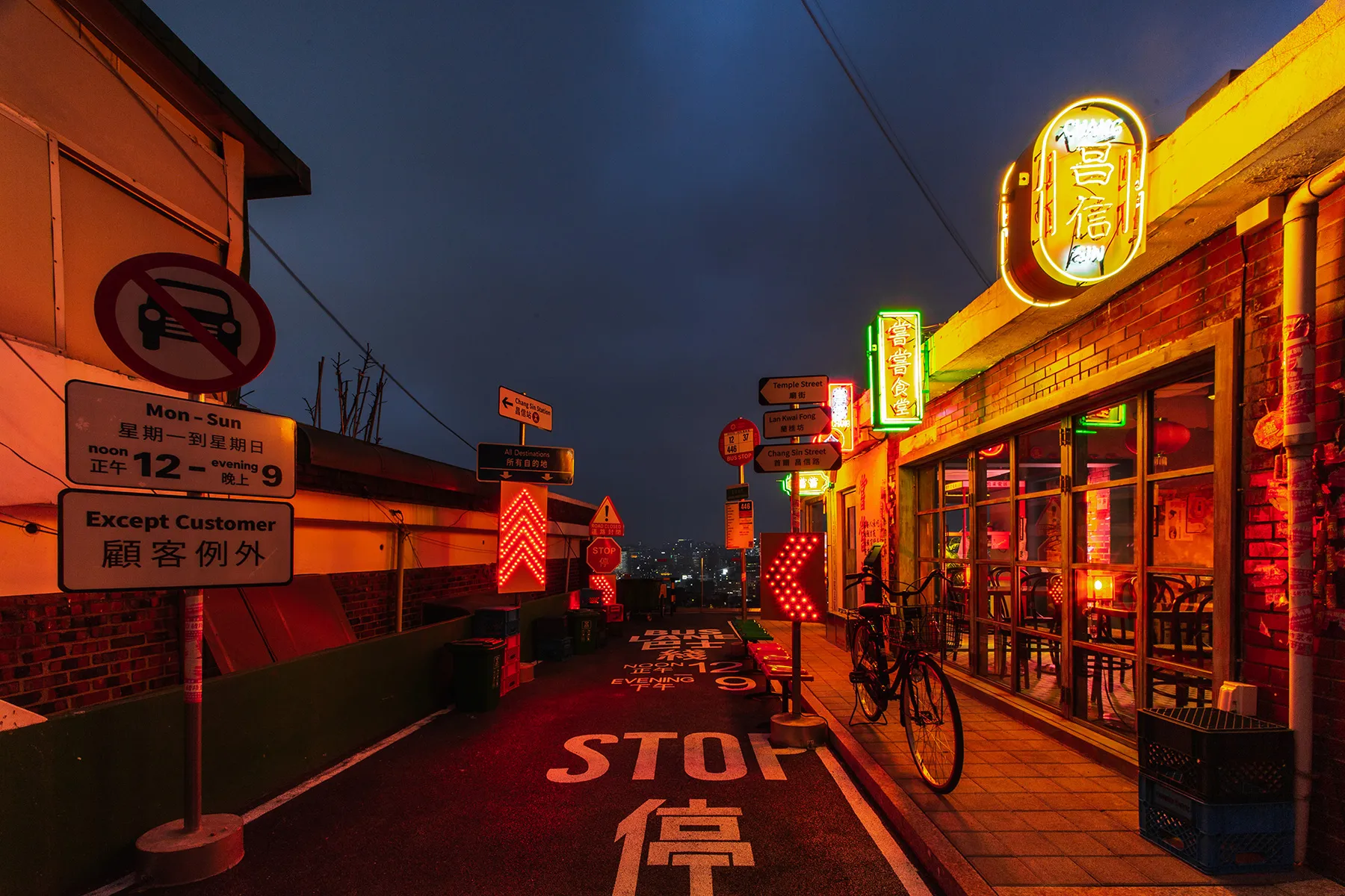
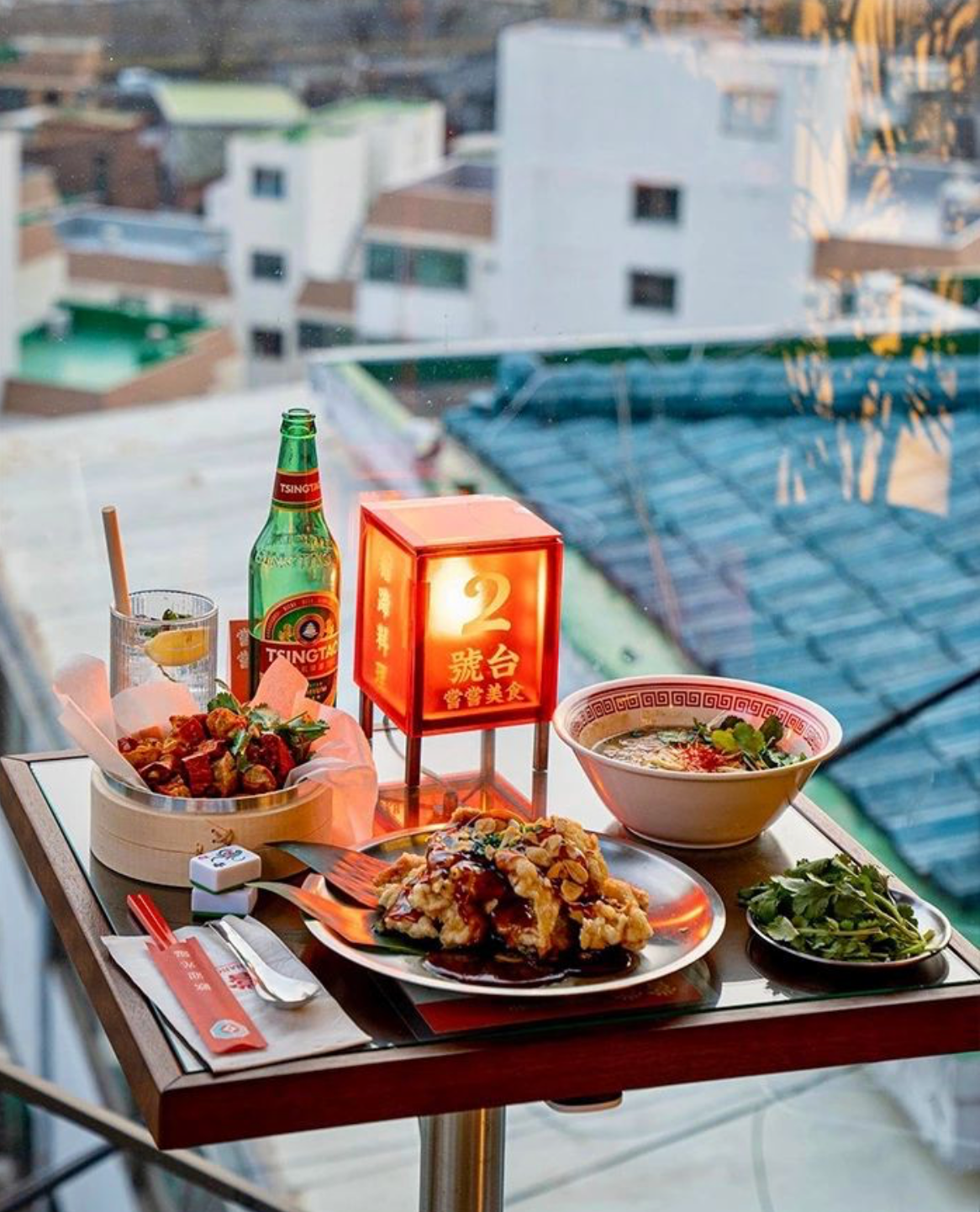
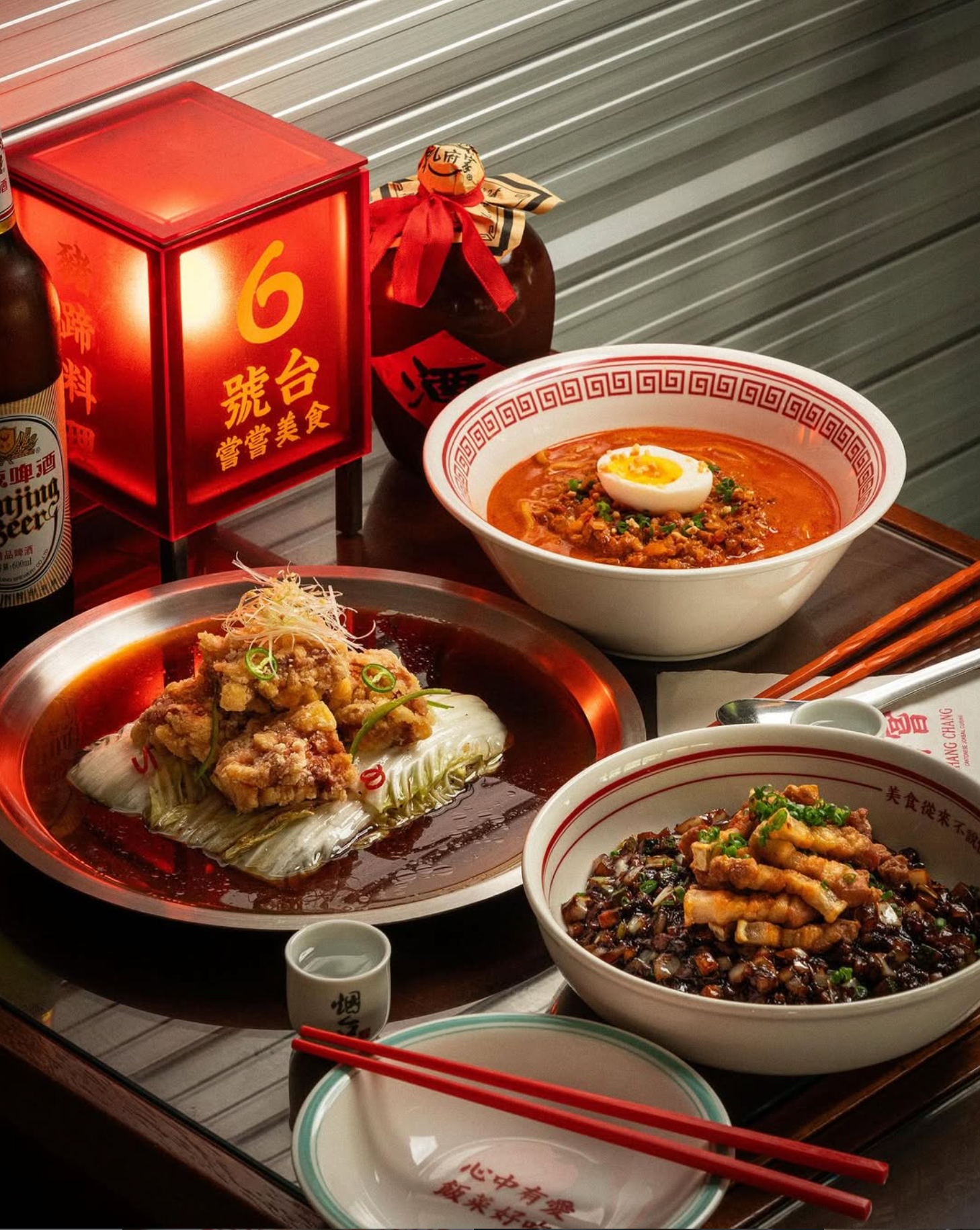
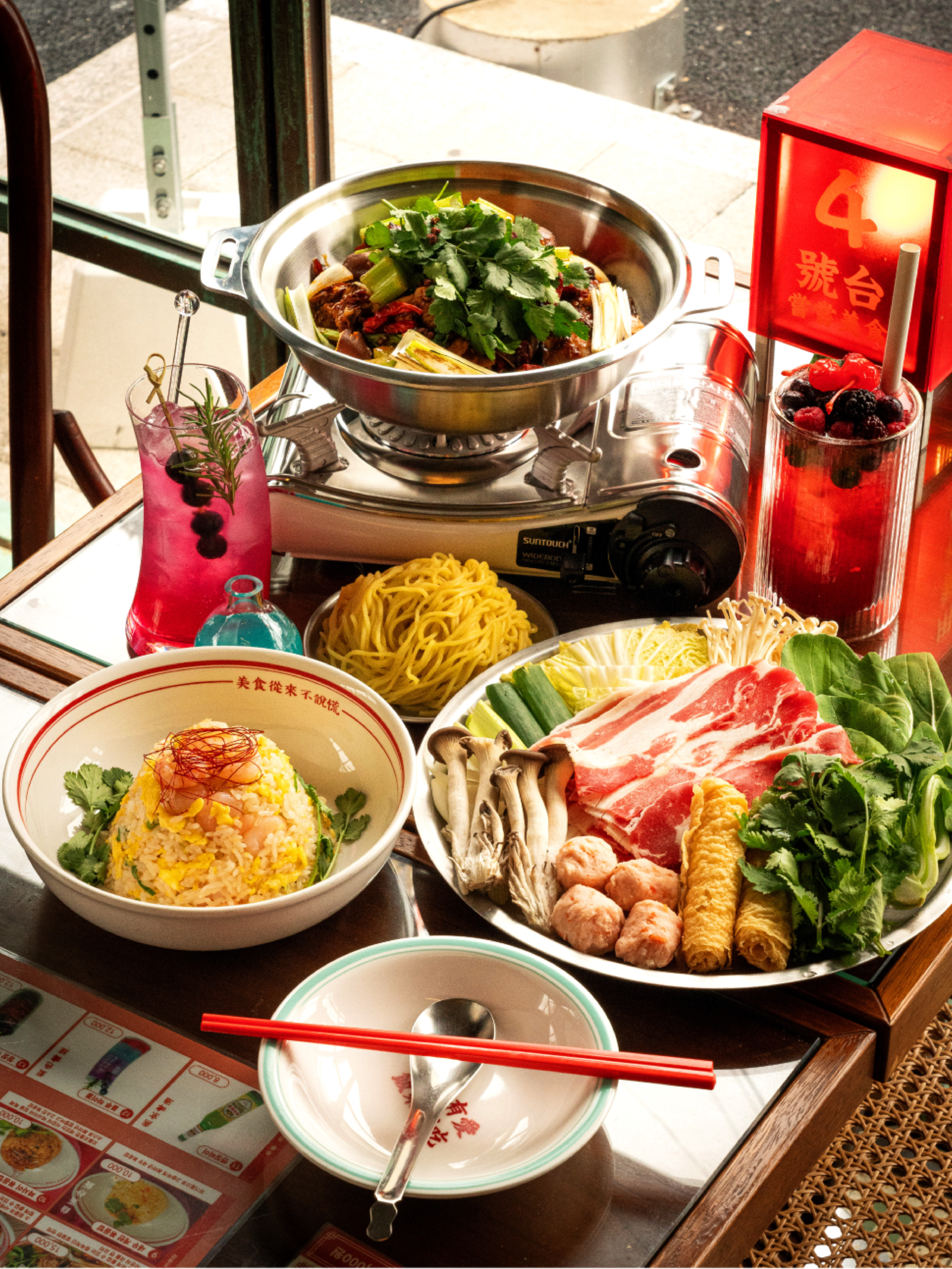
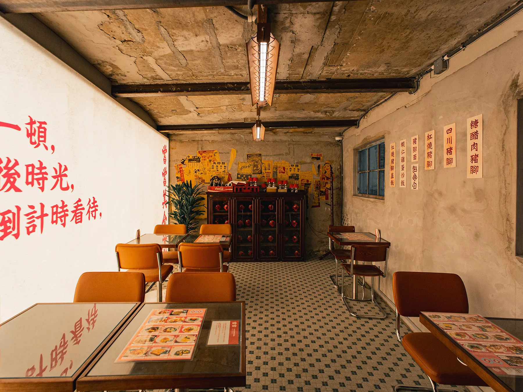
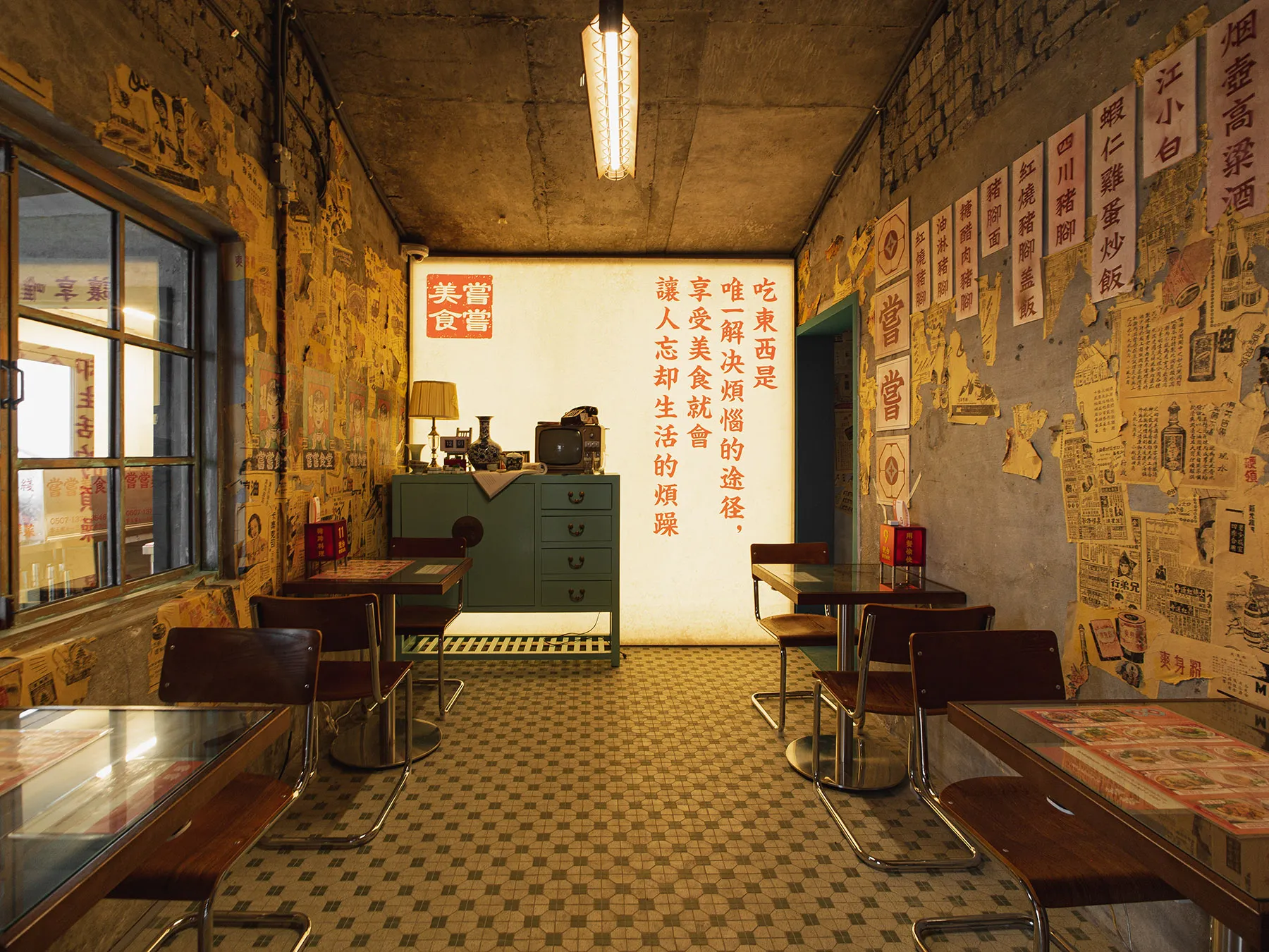
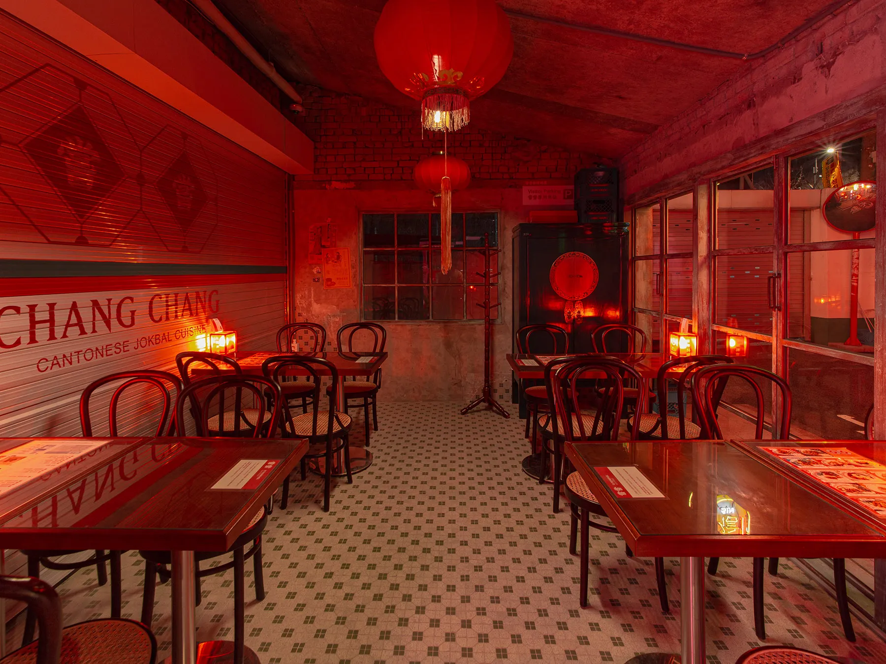
창신동의 오래된 건물을 홍콩의 밤거리와 오래된 여관을 연상시키는 중식 브랜드로 재해석한 프로젝트입니다.
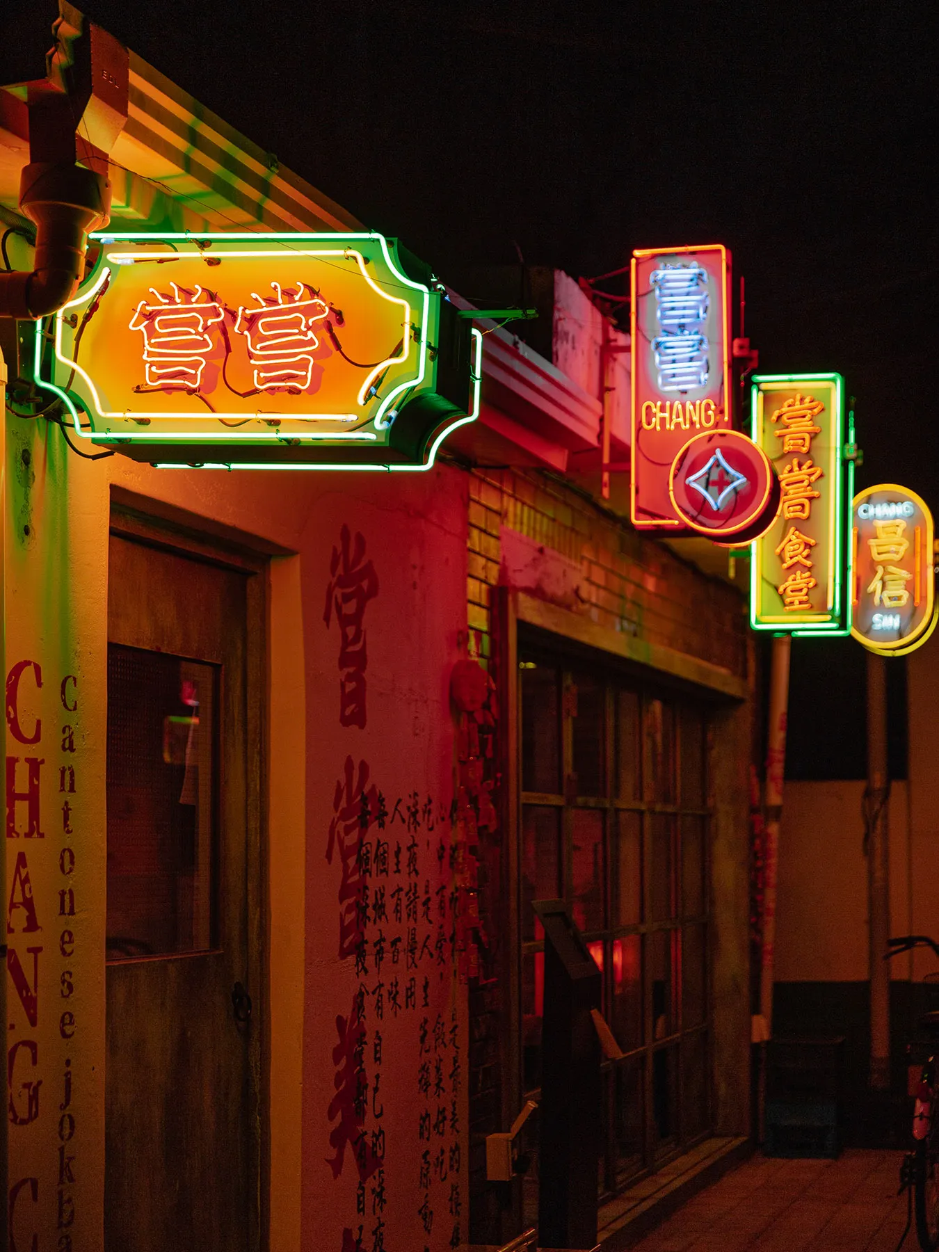
‘창창’이라는 이름은 창신동의 ‘창’에서 출발하면서, 중국어 嘗嘗(창창, 한번 맛보기를 권하는 표현)의 의미를 함께 담은 이름입니다. 장소와 중식이라는 두 가지 맥락을 네이밍에서부터 연결하고, 이를 홍콩의 오래된 골목과 여관을 연상시키는 시각 언어로 확장했습니다.
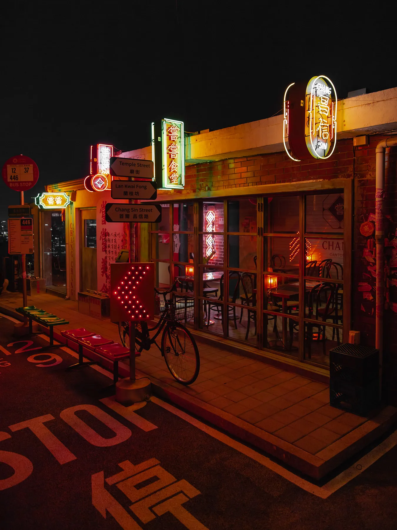
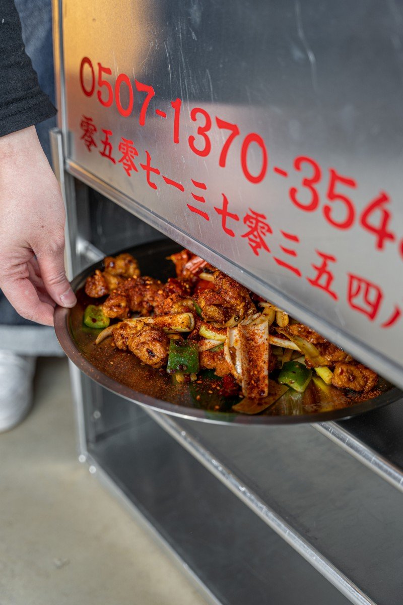
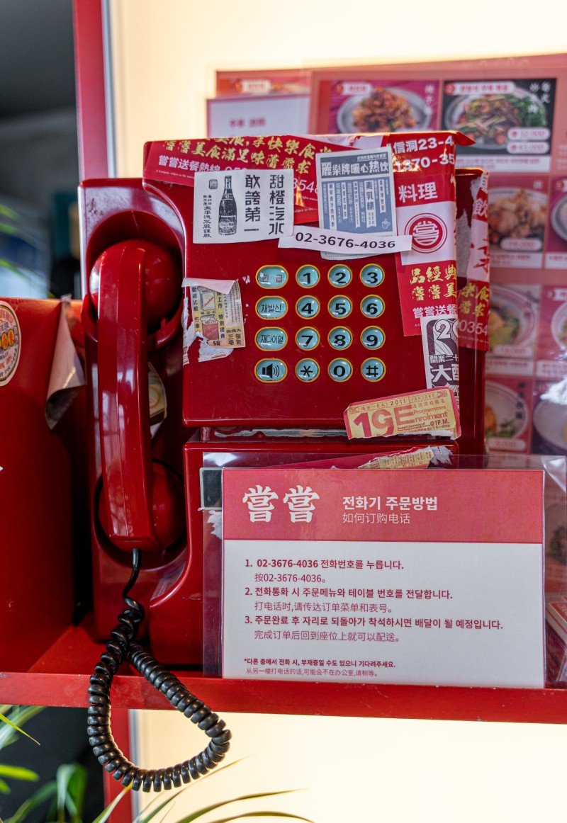
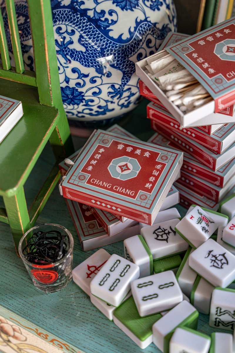
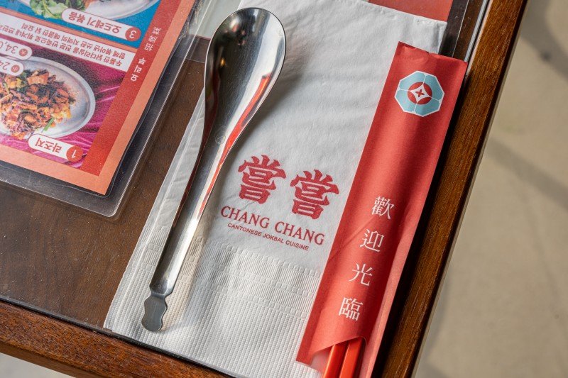
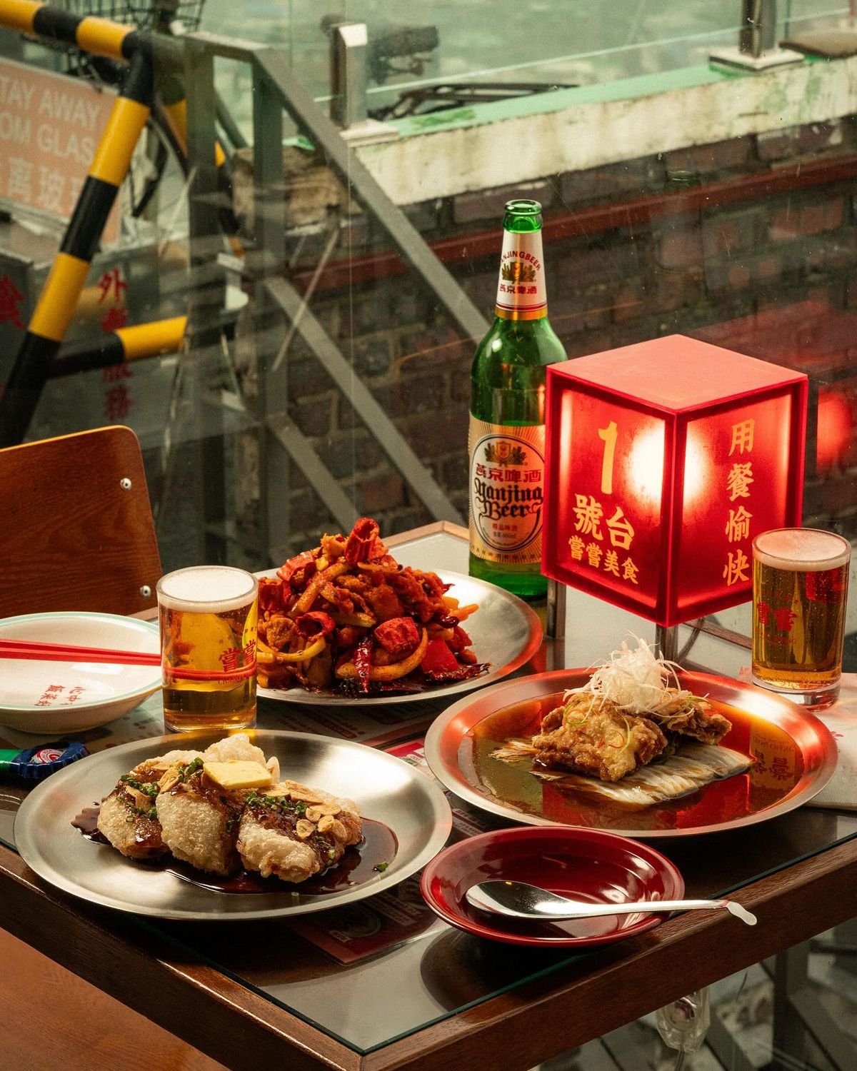
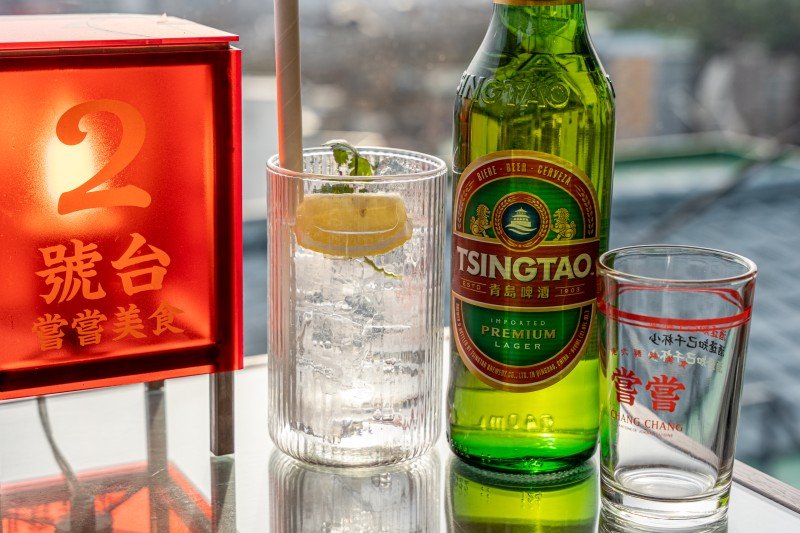
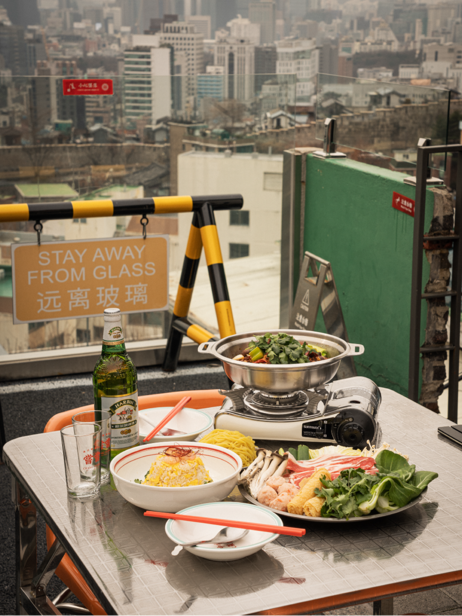
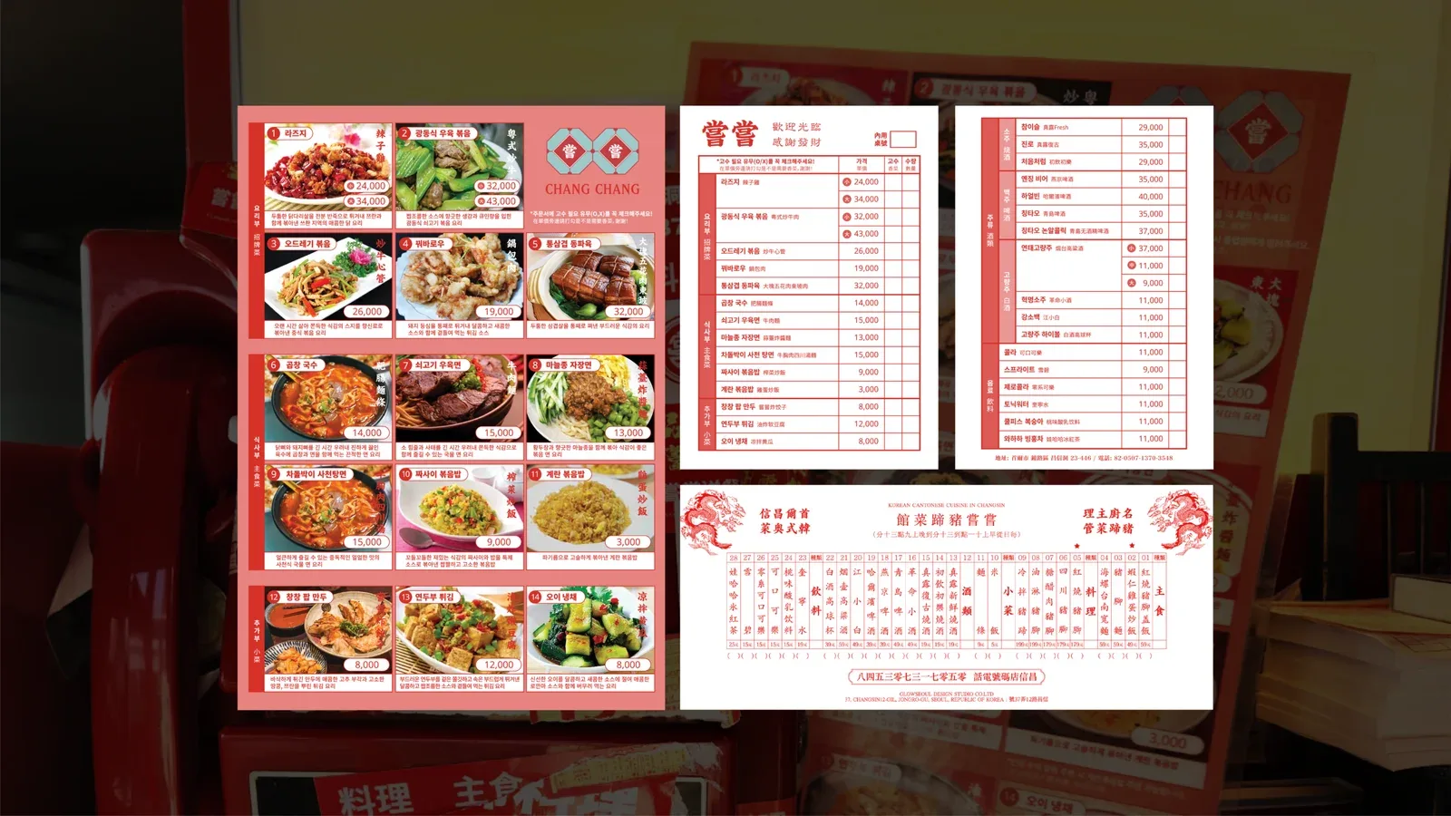
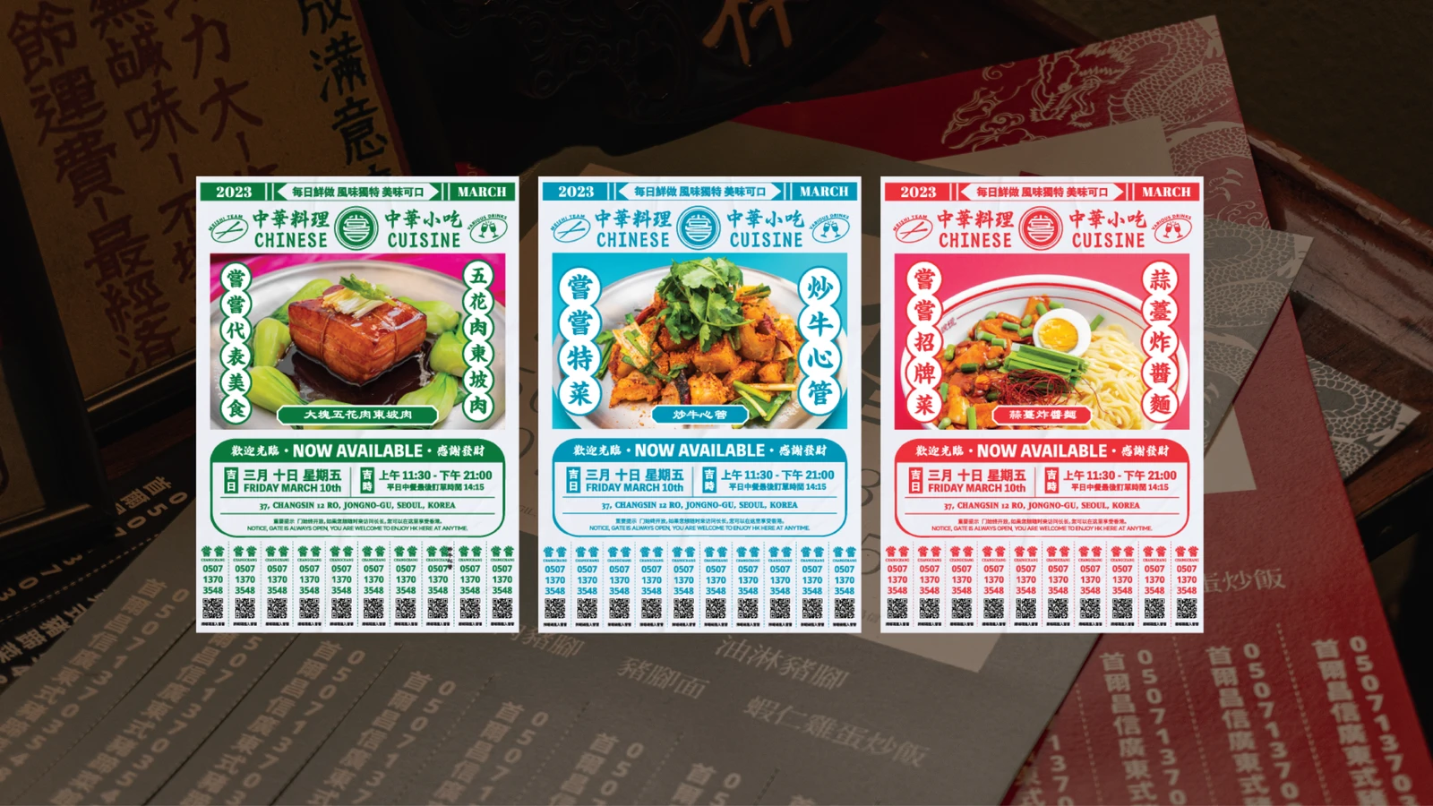
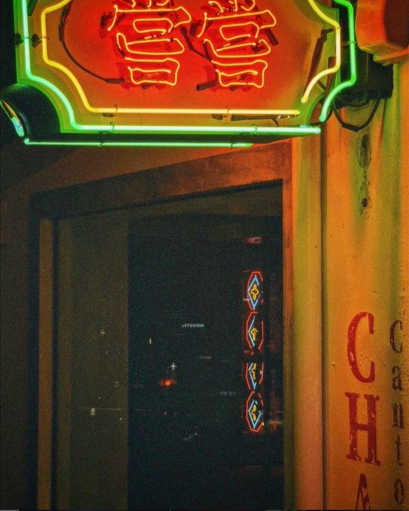
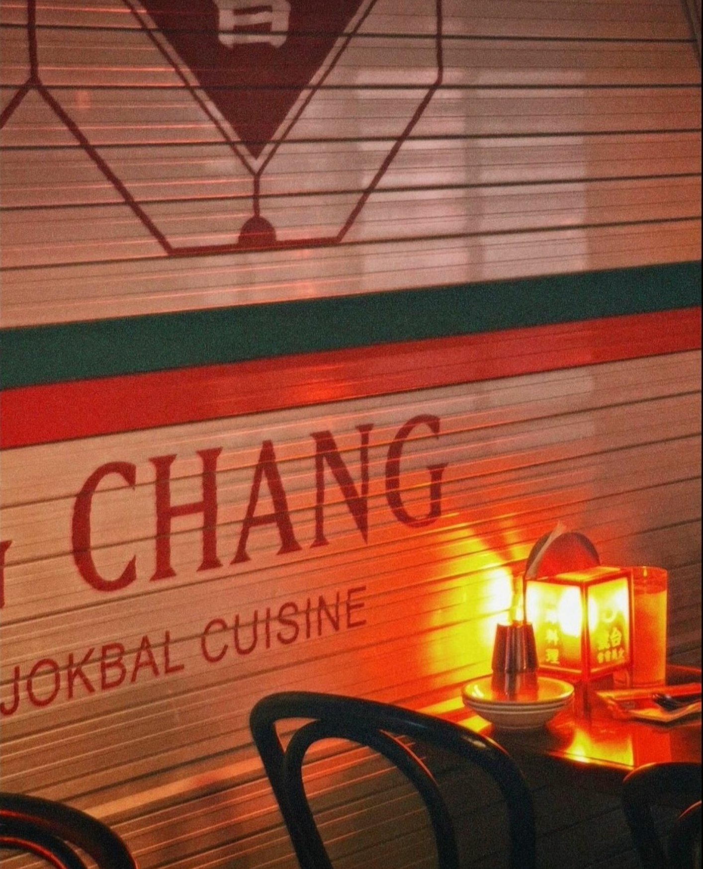
BI와 패키지를 비롯해 내·외부 네온, 방향 지주사인, 버스 정류장을 연상시키는 사인, 바닥 스텐실, 벽면 일러스트와 중국어 그래픽 등을 전개해 브랜드의 이름에서 시작된 이야기가 패키지부터 공간의 작은 요소까지 이어지도록 구성했습니다.
(EN)
A project that reinterpreted an old building in Changsin-dong as a Chinese dining brand evoking Hong Kong's night streets and its aged guesthouses.
The name Chang Chang starts from the 'Chang' of Changsin-dong while also carrying the meaning of the Chinese 嘗嘗 (chang chang, an expression inviting someone to have a taste). The two contexts — the place and Chinese cuisine — are tied together from the naming onward, then extended into a visual language that recalls Hong Kong's old alleys and guesthouses.
From the brand identity and packaging to interior and exterior neon, directional post signs, a sign evoking a bus stop, floor stencils, wall illustrations and Chinese-language graphics, everything was developed so that the story beginning with the brand's name continues from the packaging down to the smallest elements of the space.




CREDITS
Selected images by GLOW SEOUL.