DONUT JUNGSU
Brand Story / Brand Identity / Logo Design / Character & Graphic Motif / Packaging / Signage / Spatial Graphics / Production & On-site Supervision
(KO)
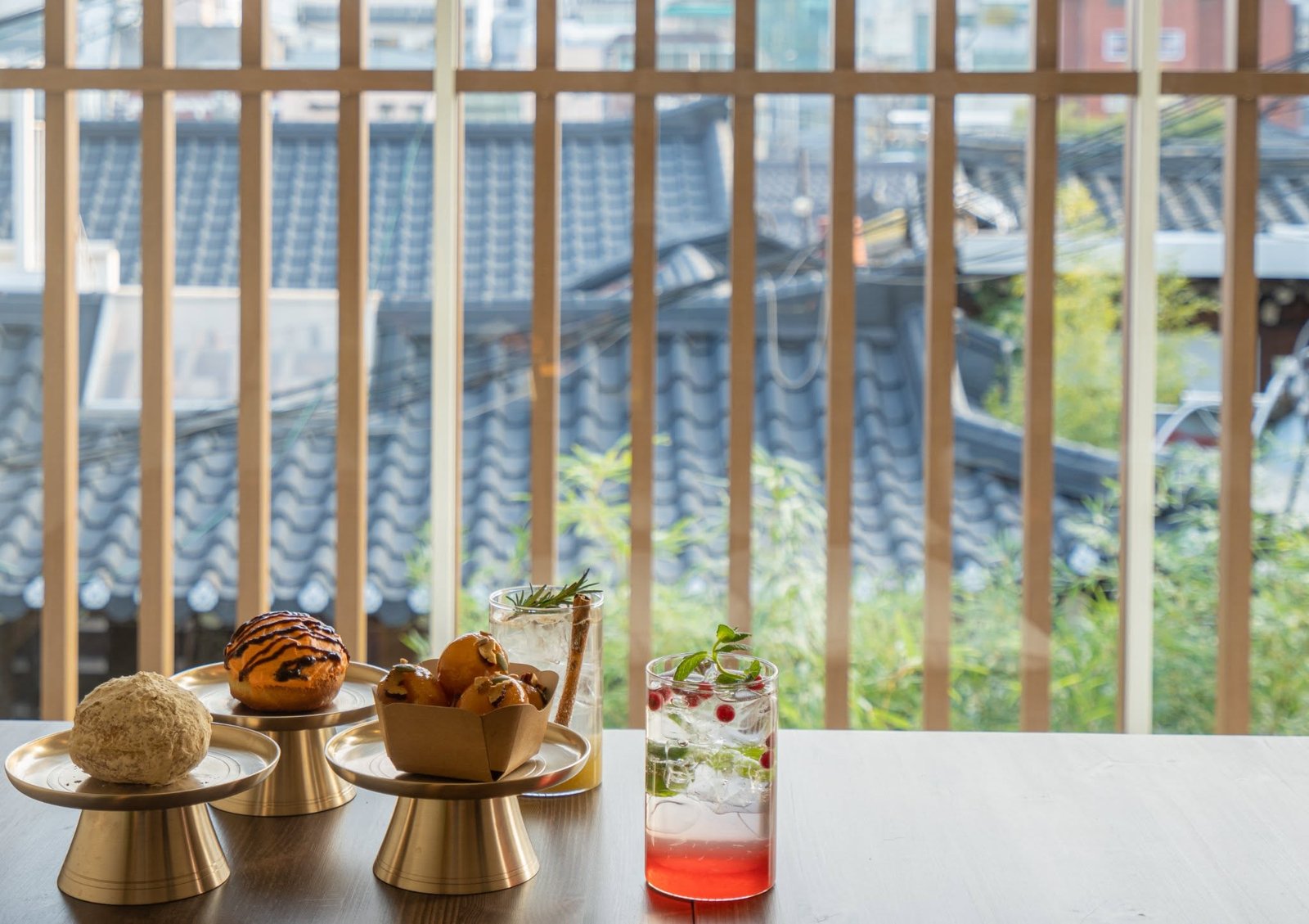
도넛정수는 한국의 전통 디저트 주악(糔角)을 현대적으로 재해석한 한국식 도넛 브랜드다. 신선한 생막걸리를 활용해 만든 쫀득한 식감을 중심으로 동서양의 다양한 재료를 조합해 여러 가지 맛을 선보이며, 전통적인 레시피를 오늘의 방식으로 새롭게 경험할 수 있도록 기획했다.
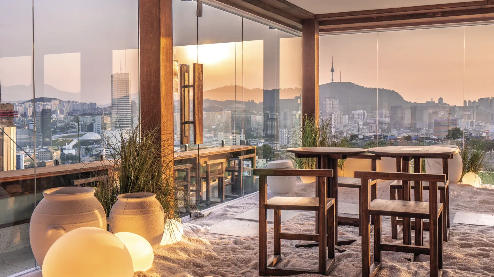
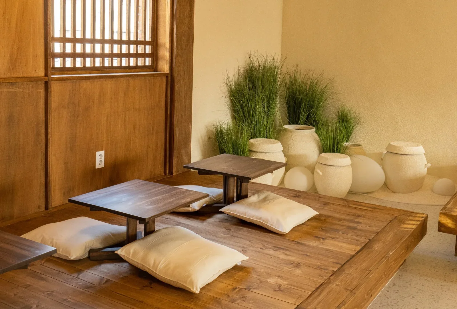
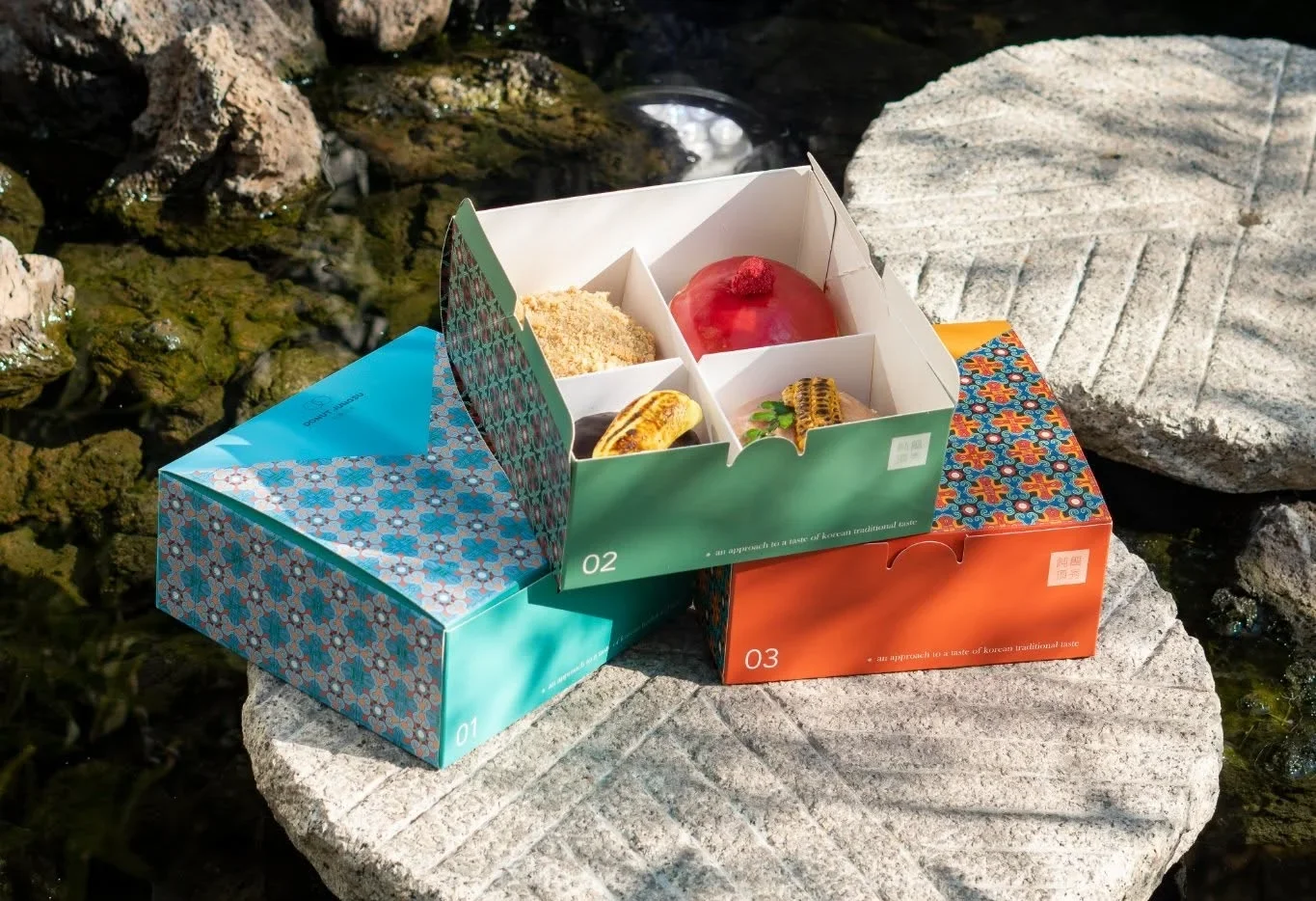
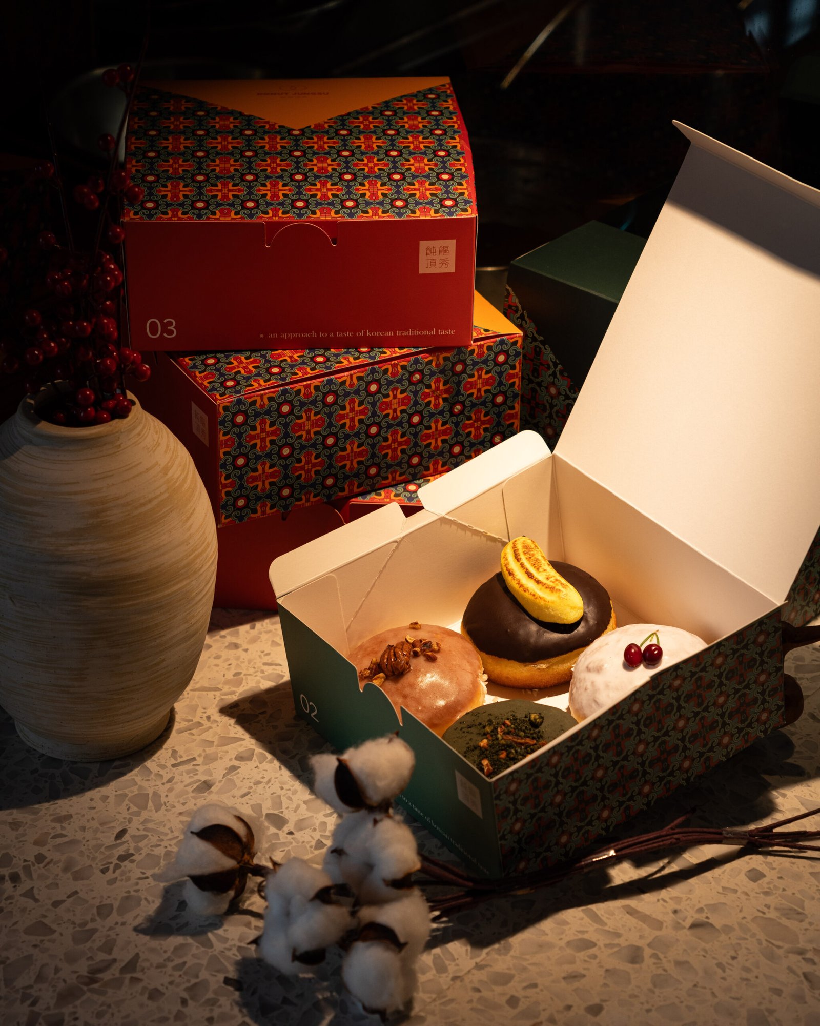
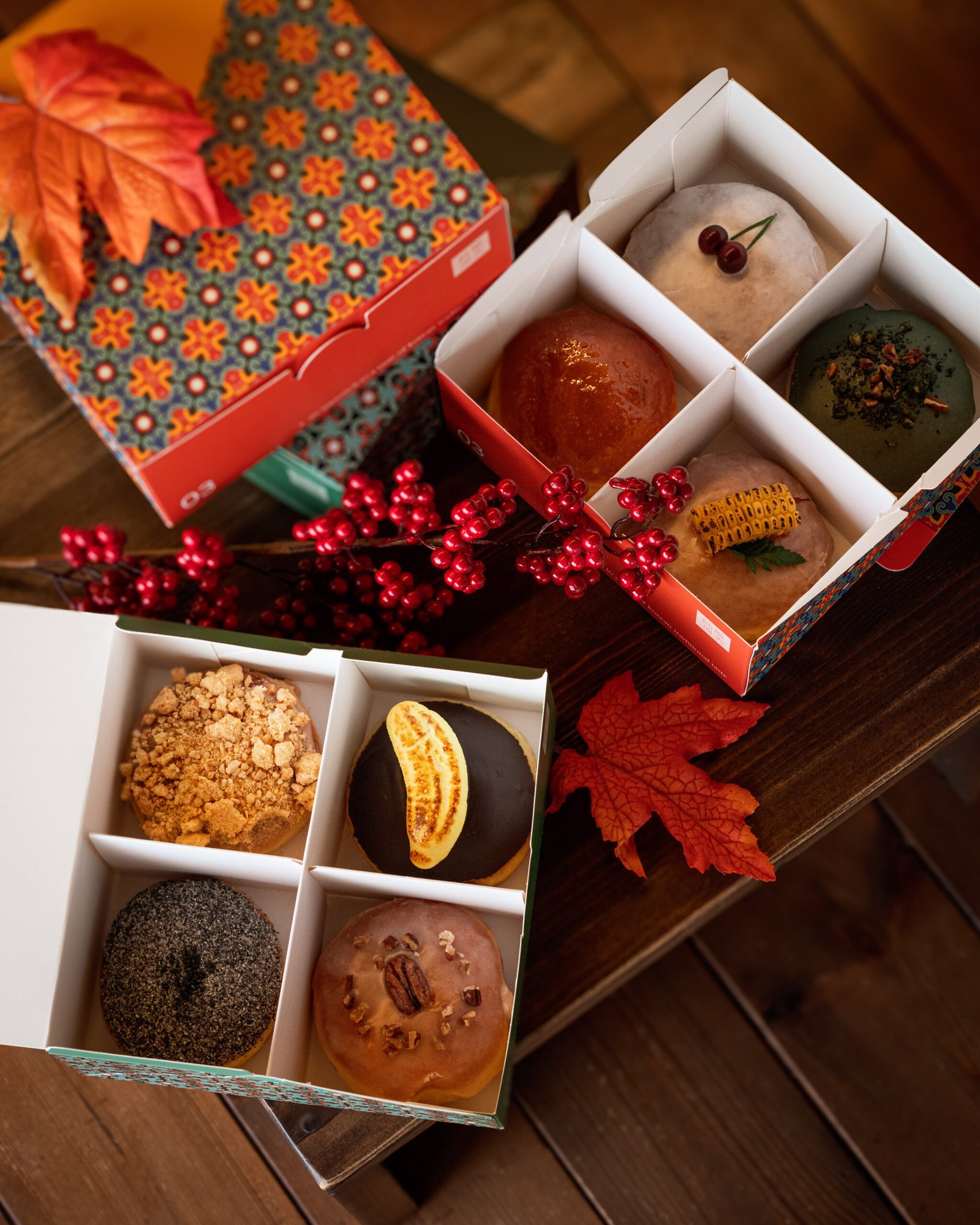
브랜드의 핵심 캐릭터는 한국 설화 「해님달님」 속 ‘떡 하나 주면 안 잡아먹지’의 호랑이에서 착안했다. 익숙한 이야기를 위트 있는 브랜드 아이덴티티로 재해석하고, 메인 아이덴티티 컬러인 오렌지를 중심으로 도넛정수만의 선명한 인상을 구축했다. 또한 단청 무늬를 활용한 패키지와 그래픽 시스템을 전개해 전통적인 색과 패턴을 다양한 방식으로 변주했으며, 목재 중심의 공간과 연결해 한국적인 정서와 현대적인 감각이 공존하는 브랜드 경험을 완성했다.
브랜드 스토리와 아이덴티티를 바탕으로 로고, 캐릭터 및 그래픽 모티프, 패키지, 사이니지, 공간 그래픽 전반을 디자인했으며, 각각의 요소가 실제 공간 안에서 자연스럽게 구현될 수 있도록 제작 및 현장 시공 감리까지 진행했다.
(EN)
DONUT JUNGSU is a Korean-style donut brand that reinterprets juak (糔角), a traditional Korean confection, in a contemporary way. Made with fresh makgeolli for a distinctive chewy texture, the brand brings traditional recipes into a modern context.
The brand’s tiger character was inspired by the Korean folktale Haenim Dalnim (The Sun and the Moon), particularly the tiger known for the line, “Give me a rice cake, and I won’t eat you.” This playful reference became a distinctive part of the identity, paired with a vivid orange brand color. Graphics inspired by dancheong, traditional Korean decorative patterns, were expanded across packaging and applications to create a flexible visual system rooted in Korean culture.
I developed the logo, character and graphic motifs, packaging, signage, and spatial graphics, and oversaw production and on-site execution.