
MIDAMOK GAMJATANG
Brand Identity / Brand Application / Packaging / Signage & Environmental Graphics / Production Management / Vendor Coordination / On-site Supervision
(KO)
오랫동안 이어져 온 뼈다귀해장국집의 시간과 친숙함을 유지하면서, 다음 세대에도 이어질 수 있는 브랜드로 정비한 리뉴얼 프로젝트입니다.
브랜드명 ‘미담옥(味談屋)’은 ‘맛으로 이야기를 나누는 집’이라는 의미로 새롭게 네이밍했습니다. 식사 한 끼와 하루의 이야기가 자연스럽게 쌓이는 동네 해장국집의 성격을 이름에 담았습니다.
메인 슬로건 ‘일일시종(一日始終)’은 하루의 시작부터 끝까지 같은 기준과 마음으로 음식을 준비하고 고객을 대한다는 태도를 담았습니다. 붉은 도장형 그래픽으로 전개해 브랜드의 주요 시각 자산으로 활용했습니다.
기존 노포의 투박하고 친숙한 분위기를 지나치게 모던하거나 고급스럽게 바꾸기보다, 오래된 가게가 가진 신뢰와 편안함은 남기고 복잡하거나 낡아 보이는 요소를 정돈하는 방향으로 아이덴티티를 구축했습니다. 네이밍과 브랜드 아이덴티티를 중심으로 메뉴, 패키지, 사인 등 실제 매장에서 반복적으로 사용하는 접점까지 함께 정리했습니다.
(EN)
A renewal project that kept the years and the familiarity of a long-running gamjatang restaurant while reorganising it into a brand that can carry on into the next generation.
The brand was newly named Midamok (味談屋), meaning 'a house where stories are shared over flavour'. The name holds the character of a neighbourhood haejangguk restaurant, where a single meal and the day's conversations naturally accumulate.
The main slogan Ilil Sijong (一日始終) expresses the attitude of preparing food and meeting guests with the same standard and the same heart from the beginning of the day to its end. Developed as a red seal-style graphic, it became the brand's principal visual asset.
Rather than turning the old restaurant's plain, familiar atmosphere into something overly modern or luxurious, the identity was built to keep the trust and ease that come with a long-established shop while tidying away what looked cluttered or worn. Around the naming and brand identity, the touchpoints used repeatedly in the restaurant itself — menus, packaging and signage — were organised together.

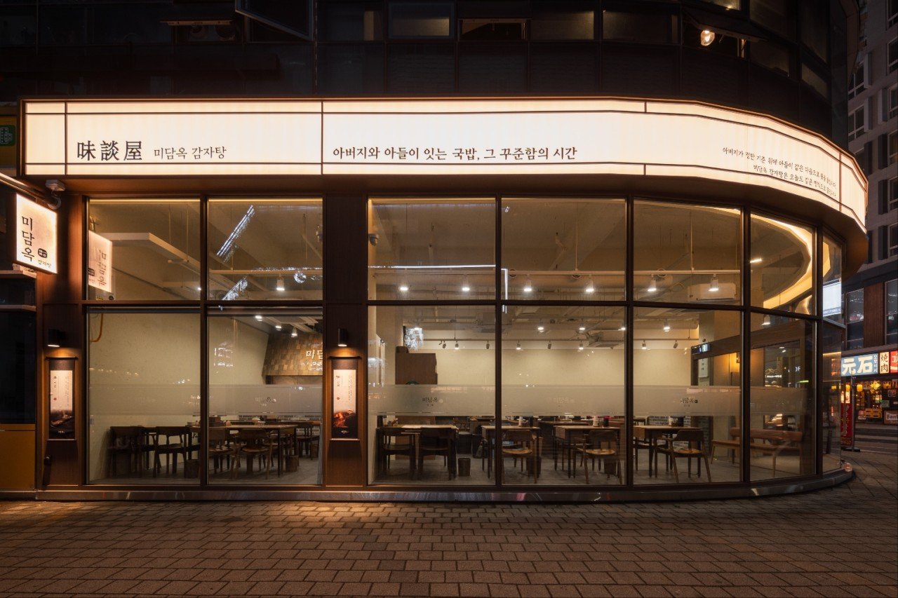
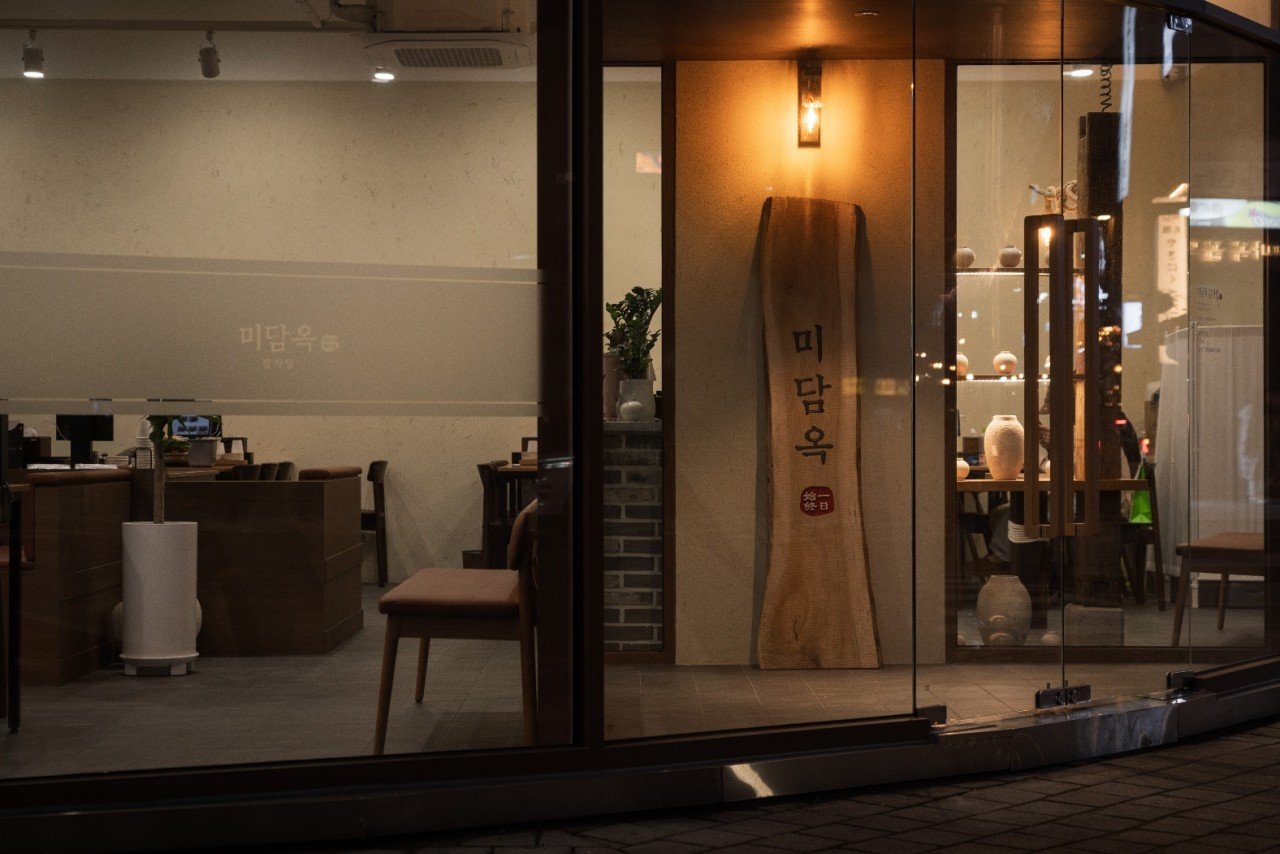

Selected images by E&SPACE.